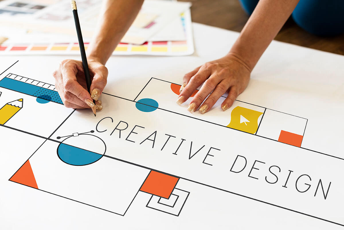
Great graphic design (whether print or digital) is an art form that relies on some basic principles to be effective. Two often overlooked principles that show polished design are color and space.
Color
Color theory is a complex topic, so here we will focusing on selecting a color palette that matches your brand and is pleasing to the eye.
Color, like much of design, is subjective to the user. The colors that I like might not be the colors you like. However, you can select colors that represent you brand image based on preference and the meaning of colors.
Here are a few meanings behind some primary colors:
Red
For many, red is often associated with aggression, love, and passion. In other cultures, red may have a different meaning like prosperity (in China) or morning (in Africa). Red can be a great accent color, but is often too overwhelming as a primary color.
Orange
Orange may represent change as it is associated to fall. It is not a coincidence the accent color for the blog you are reading is orange.
Yellow
Yellow is bright and vibrant, often associated with happiness and hope. Yellow can also be a good choice for gender neutral tones.
Green
Typically, green represents renewal, growth, and nature. It has a calming effect and is a good choice as a primary color in many brands.
Blue
Blue often represents calm and is a very friendly tone. This also often depends on the shade of blue. Light blue is more calming and darker blues are more energizing.
Space
Leaving space in your design for the eye to “breathe” is an essential aspect of design. Great designs do not simply look to pack as much as possible into as small a space as possible. Instead, leaving the right balance between whitespace and proximity is key.
What is whitespace?
Whitespace is the space in between objects in a design. Leaving enough whitespace allows your viewer to:
- Appropriately group elements in a design
- Draw attention to specific elements in the design
- Creates a clean design allowing users to process the design and makes it easier to read
This image from Adobe is a good example of some basic whitespace theory:

Whitespace grabs attention, which is counterintuitive to some. Many think that to grab a reader’s attention you need to cram as much as possible into a space. In reality, the exact opposite is true.
For example, think Apple. Apple uses tons of whitespace to create simple elegant designs that grab your attention and tell an additional story. In the ad below, the whitespace draws your attention to the macbook airs. The design also users whitespace to emphasize the thin, light, and portable nature of the device. The ad would not be nearly as effective if it showed a large image of the device.

What is proximity?
Proximity is a key element in design where objects that are closer together will naturally be grouped together by the viewer.
This means if you have items that needs to be thought of together by your reader, you probably want to place those in close proximity with enough whitespace buffer to not connect them to other items. This can be a bit subjective, but a good design will take these into account.
In general, color and space play a huge role in design, as it is often not what your cram into a space as what you leave out that makes all the difference.
Find more Marketing Resources here.


